Netflix was my proverbial gateway drug to cord-cutting, as I'm sure it was for many others. Yet as much as I truly love Netflix and its service, there are some annoyances I have with the interface of the desktop web version.
Yes, finding movies and TV shows is easy, but my main issue is the scrolling feature. This feature requires that I hover over the arrows with my cursor in order to scroll through the titles in any given category, all at a glacial pace.

Evidently, I'm not alone in my frustrations. Recently, developer Renan Cakirerk created a simple bookmarklet that enables a grid-like view for your Netflix homepage, making it easier to go through titles with just a simple click. He calls it "Netflix God Mode Bookmarklet," and it's simple to set up.
Getting Started
Just visit Renan's website from whatever web browser you watch Netflix in, then click on and drag the green "Netflix | God Mode" button (this is the bookmarklet) to your Bookmarks or Favorites bar.
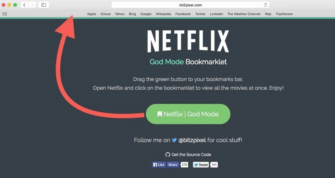
Note: To display the Bookmarks Bar in Chrome, simply hit Command Shift B on Mac or Control Shift B on Windows. The Mac shortcut works for Safari's Favorites Bar, too. For either Firefox or Internet Explorer, go to View -> Toolbars and select Bookmarks Toolbar or Favorites Bar, respectively.
Enabling God Mode
In order to use God Mode, all you have to do sign into Netflix and click on the bookmarklet in your Bookmarks or Favorites bar.
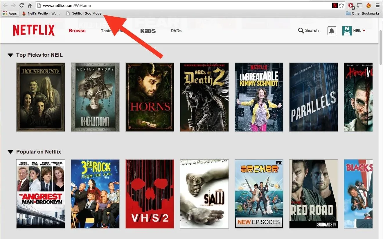
You'll then see the confined categories on the homepage expand to make viewing all titles at once a cinch.
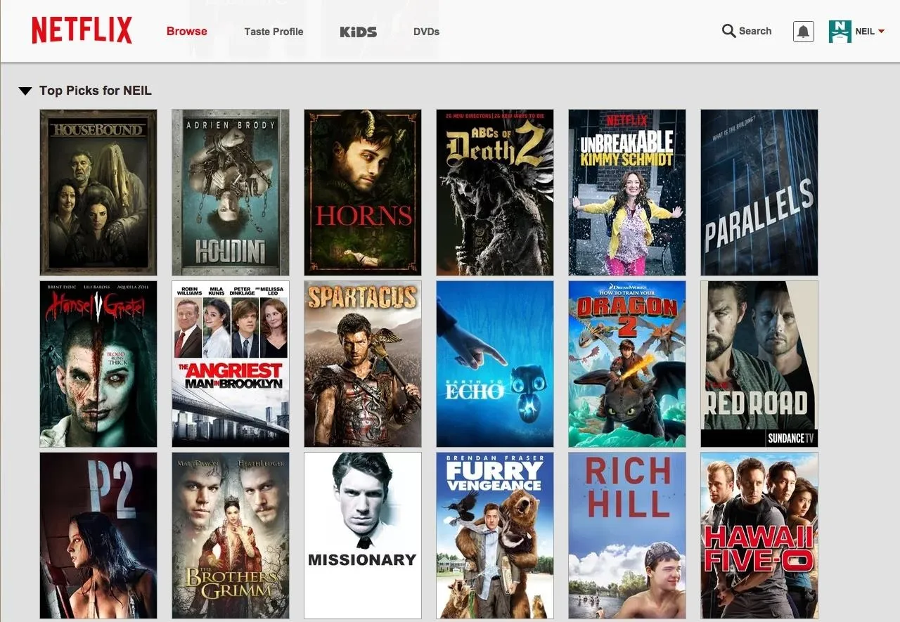
Again, this only applies to the homepage of the Netflix website—you cannot use God Mode in any other page (My List, New Arrivals, etc.), at least not yet. Hopefully we'll see this in an updated version soon.
What do you think of God Mode? Did it make your Netflix browsing experience better? Let us know in the comments below. Also, make sure to follow Gadget Hacks on Facebook, Google+, and Twitter to see more cord-cutting tips like this one.













Comments
Be the first, drop a comment!